Check out this absolutely incredible visualization of the growth of protest movements worldwide, from 1979-2013, all in one time-lapse image.
Penn State doctoral candidate John Beieler has created a time-lapse visualization of every protest on the planet since 1979. And it is jaw-dropping, and I mean that in a real way, not in a BS blogger-overhyping-this-incredible-amazing-thing way.
No, this is truly amazing, because what you’ll see is tiny blips popping off here and there in the 1970s—a time we think of as highly politically charged—and nearly eclipsing the world starting with the late 90s anti-globalization protests and the second Iraq War up till our present moment.
I would love to see this overlaid with time-lapse visualizations of other factors: global warming, globalization, wars, food shortage, and the spread of the Internet.
Also fruitful: Comparing this data with media coverage and treatment of protest. Why is it easy to think of the 1960s and 70s as a time of dissent and our time as a more ordered, controlled and conformist period when the data so clearly shows that there is no comparison in how much protest there is now compared to then?
(Note: The original visualization has been taken down. Luckily, somebody captured it and put it up on YouTube, so while it’s now slightly less interactive, you can still see it!)
Via Foreign Policy:
This is what data from a world in turmoil looks like. The Global Database of Events, Language, and Tone (GDELT) tracks news reports and codes them for 58 fields, from where an incident took place to what sort of event it was (these maps look at protests, violence, and changes in military and police posture) to ethnic and religious affiliations, among other categories. The dataset has recorded nearly 250 million events since 1979, according to its website, and is updated daily…
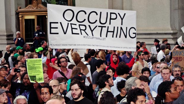
The map also shows some of the limits of Big Data — and trying to reduce major global events to coded variables. Take, for example, the protests across the United States in late 2011: Some are Occupy protests, others are Tea Party protests, but the difference in the political identity of those demonstrations isn’t reflected in the map. There are some strange things that happen when the data are mapped, as well. A cursory glance at the map would suggest that Kansas is the most restive state in the union, but really the frequent protests popping up somewhere near Wichita are every media mention of a protest in the United States that doesn’t specify a city (the same goes for that flickering dot north of Mongolia in Middle-of-Nowhere, Russia).
(Thanks to @NoahShachtman and R. U. Sirius!)